Table of Contents
- Quick answer: the best white paint for a Toronto condo
- Understanding white paint undertones (with measured LRV)
- How to match white to your unit's light direction
- The 8 best Benjamin Moore whites for Toronto condos
- Trim vs wall whites and choosing sheen
- How to test white paint in your condo
- Get expert white paint advice for your Toronto condo
Quick answer: the best white paint for a Toronto condo
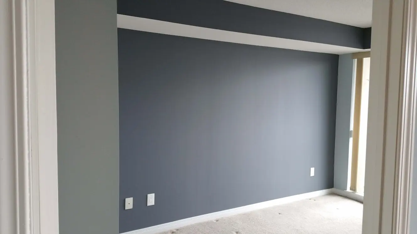
There is no single best white for every condo. The right one depends on which way your unit faces and the light it receives. In our Toronto projects, Benjamin Moore White Dove (OC-17) is the most versatile all-rounder, while Chantilly Lace (OC-65) wins for crisp, modern units. Match the white to your light, then test it on the actual wall.
Key Takeaways
- Whites have undertones: warm whites lean yellow, red, or cream; cool whites lean blue or grey; true whites stay neutral.
- Match the white to your light: north-facing Toronto units get cool light, so warm whites balance it; south and west units take cooler whites well.
- White Dove (OC-17) is the most versatile soft warm white; Chantilly Lace (OC-65) is the crispest true white for modern condos.
- Trim usually goes a half-shade crisper than walls, or use the same white in different sheens.
- Always test large swatches in your own unit in both morning and evening light before committing.
Choosing white sounds simple until you stand in the paint aisle facing forty nearly identical chips. The difference between them is undertone, and undertone is what trips people up. For the bigger picture on prepping and painting a unit start to finish, see our condo painting guide.
Understanding white paint undertones (with measured LRV)
Every white paint carries an undertone, and that hidden colour is what makes one white feel cosy and another feel clinical. The objective number that distinguishes them is Light Reflectance Value (LRV), a 0-100 scale where 0 is pure black and 100 is pure white, measuring how much visible light a colour bounces back into the room. Every Benjamin Moore colour chip has its LRV printed on the back; designers use it to compare whites quantitatively rather than by guess.
The Benjamin Moore white LRV scale
| White | BM code | LRV | Undertone | Reads as |
|---|---|---|---|---|
| Chantilly Lace | OC-65 | 92.20 | Minimal | Crisp, modern, near-pure white |
| Super White | OC-152 | 94.27 | Minimal | Brightest BM white |
| Simply White | OC-117 | 91.70 | Subtle yellow | Warm, sunny, slightly cheerful |
| White Dove | OC-17 | 85.38 | Greige (warm yellow + grey) | Soft warm, most versatile |
| Cloud White | OC-130 | 84.83 | Creamy yellow | Warm, cosy, leans traditional |
| Decorator's White | OC-149 | 84.61 | Cool grey + slight purple | Crisp cool, slightly contemporary |
| Swiss Coffee | OC-45 | 83.95 | Warm cream | Soft, slightly yellow-cream |
| Paper White | OC-55 | 82.74 | Cool blue-grey | Cool, slightly contemporary |
Reading the LRV practically:
- LRV 90+: bounces nearly all available light back into the room; useful in dim or north-facing spaces, but unforgiving on wall flaws
- LRV 84-90: most popular condo range; bright but slightly softer
- LRV 80-84: warmer, calmer whites; better at hiding patches and texture
The three broad undertone families remain the practical division:
Warm whites carry yellow, red, or cream undertones. They feel soft and inviting. White Dove (LRV 85.38, greige), Cloud White (84.83), Simply White (91.70), and Swiss Coffee (83.95) all sit here. Warm whites balance cool north-facing light and tend to hide minor wall flaws.
Cool whites carry blue or grey undertones. Decorator's White (84.61) and Paper White (82.74) belong to this group. Cool whites shine in bright, warm-lit spaces but can turn flat or grey in dim, north-facing rooms.
True or crisp whites have minimal undertone and read close to pure white. Chantilly Lace (LRV 92.20) and Super White (94.27) are the BM examples. Best for modern, high-contrast condos and big windows; can feel slightly cold in low light.
How to match white to your unit's light direction
The most important rule we follow on every Toronto condo job: warm whites balance cool light, and cool whites suit warm light. Your unit's orientation decides everything, so check which way your main windows face before you fall in love with a chip.
North-facing Toronto units receive cool, blue-tinted daylight all day. That cool cast can pull a neutral white toward grey and make the room feel chilly. A warm white like White Dove or Cloud White counteracts it and keeps the space feeling clean rather than cold.
South and west-facing units get warmer, stronger sunlight, especially in the afternoon. These rooms can carry cooler whites like Decorator's White or Paper White without looking dingy, and the sun keeps the white looking bright and fresh.
East-facing units sit in between, with warm morning light and cooler afternoons. A soft warm white like White Dove is the safest pick here because it stays balanced as the light shifts through the day.
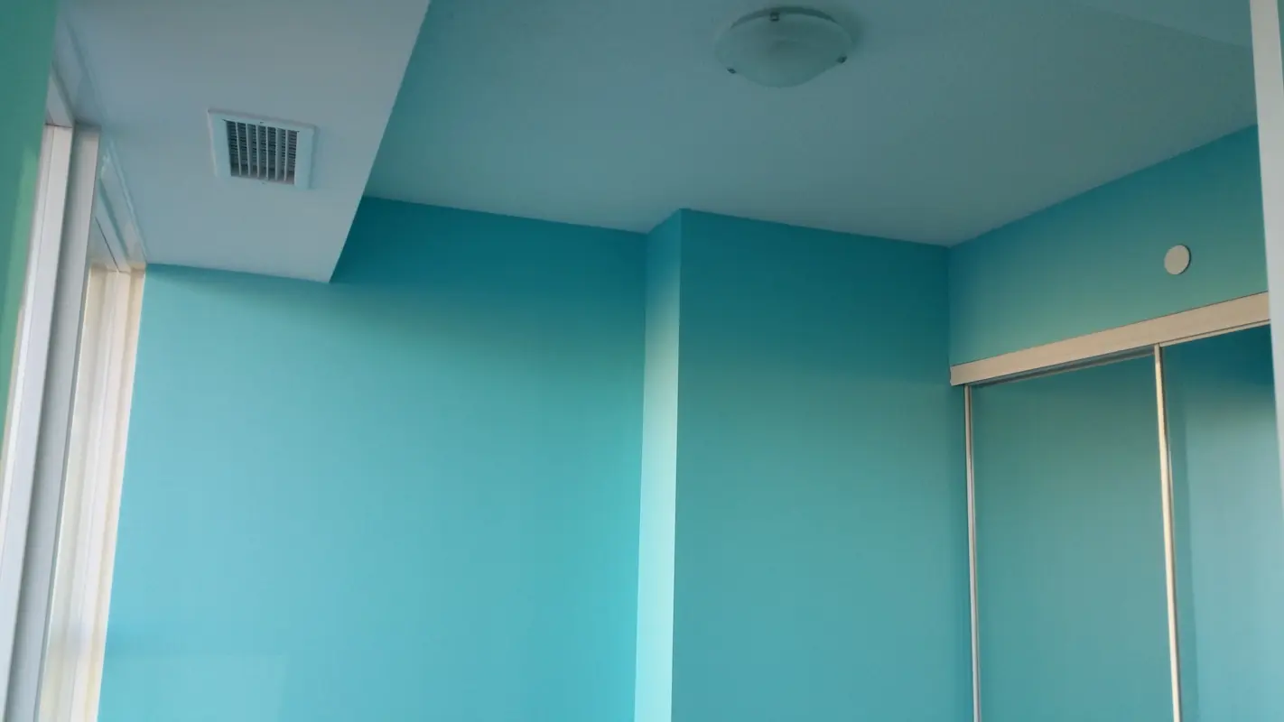
Where your unit sits in the city matters too. Tower-dense neighbourhoods like CityPlace and Liberty Village often have units staring straight at neighbouring glass buildings. Those towers bounce cool, indirect light back through the window, which can chill a white and pull it grey. In those units we lean warmer, usually White Dove or Cloud White, to push back against that borrowed light.
Bright lake-facing units tell the opposite story. Condos in Humber Bay Shores and along Harbourfront catch clean, reflective daylight off the water, so they comfortably carry crisper cool whites like Chantilly Lace without falling flat. Big-window King West and Distillery lofts flood with daylight as well, which makes almost any white look fresh, though the warm afternoon sun there can nudge a creamy white toward yellow.
We learned this the hard way once on a north-facing Fort York unit. The client had chosen a cool white, and by mid-afternoon the living room read distinctly grey-blue and cold, almost like a cloudy sky indoors. We repainted it in White Dove, and the room finally settled into the soft, clean white she had pictured. The colour was never the problem; the light direction was.
The 8 best Benjamin Moore whites for Toronto condos
We paint exclusively with Benjamin Moore, and these eight whites cover almost every condo scenario we encounter across the GTA. Each has a distinct personality, so read the undertone notes before you choose.
1. Chantilly Lace (OC-65)
The crispest true white in the line, with almost no undertone. It reads clean and bright, which makes it the top pick for modern, minimalist condos and big-window units. We also use it constantly for trim. In very low-light or north-facing rooms it can feel a touch cold, so pair it with warm accents.
2. White Dove (OC-17)
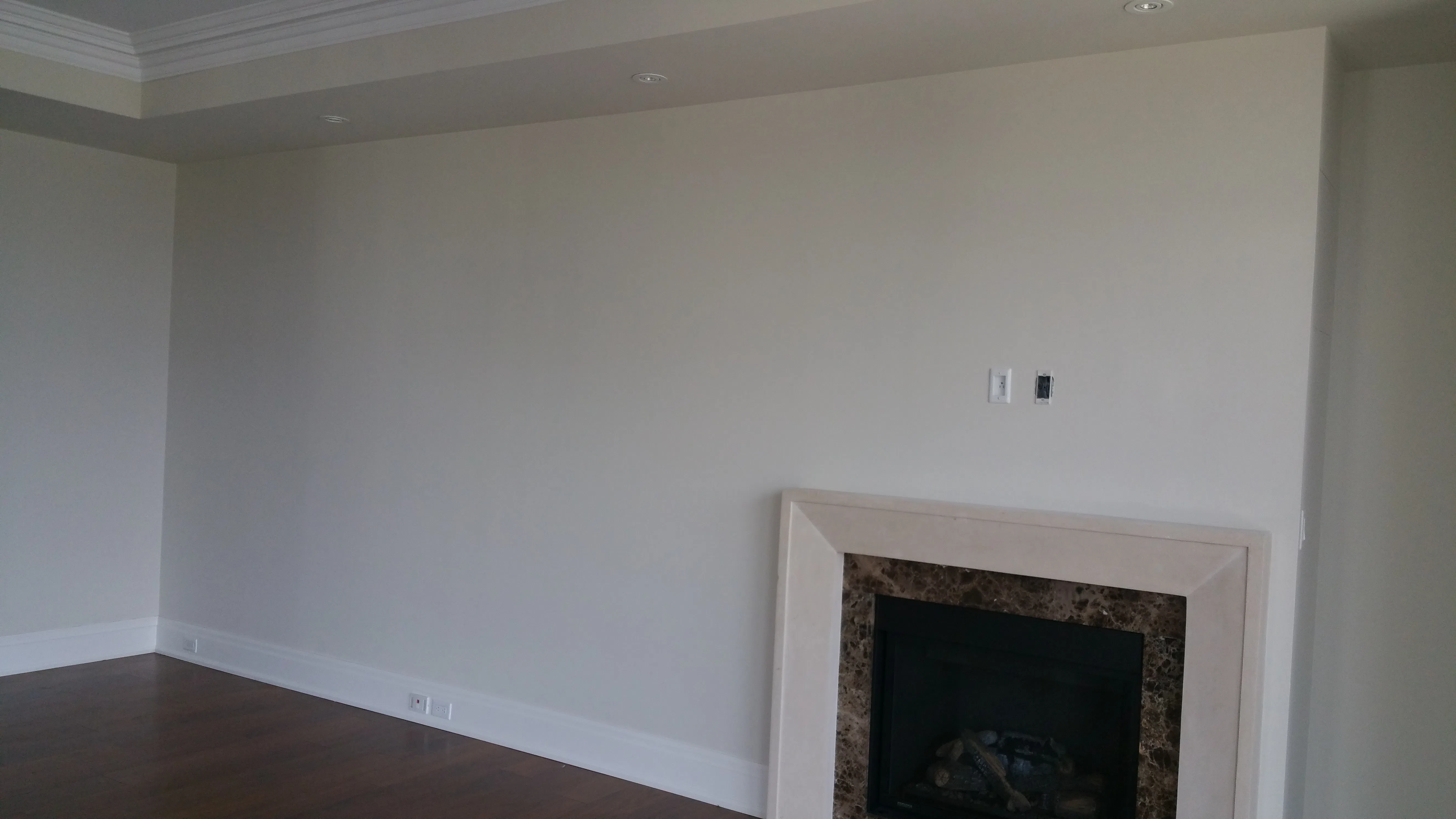
Our most-used white, full stop. It is a soft warm white with a gentle creamy-grey base that flatters nearly any light direction. It softens a room without looking yellow. It hides minor wall flaws. It works on walls and trim alike. If you want one safe choice for a whole condo, this is it.
3. Cloud White (OC-130)
A warm, creamy white that brings noticeable cosiness. It is an excellent choice for north-facing units where you want to push back against cool light. Cloud White feels relaxed and homey rather than crisp, so it suits bedrooms and living spaces more than ultra-modern schemes.
4. Simply White (OC-117)
A bright warm white that leans cheerful and fresh. It carries a subtle yellow undertone that keeps spaces feeling sunny, making it a good fit for units that need a lift. In strong south-facing light, watch that it does not read too yellow; test it before committing.
5. Decorator's White (CC-20)
A cool, crisp white with a clean grey undertone. Modern to the core. It shines in bright, warm-lit south and west-facing units. Decorator's White makes a sharp trim against warmer walls and suits high-contrast, modern condo palettes. Avoid it in dim north rooms where it can flatten to grey.
6. Swiss Coffee (OC-45)
A warm, soft white with a creamy, slightly beige character. It is warmer than White Dove and adds gentle depth without going full cream. Swiss Coffee works well in cosy, light-starved spaces and pairs nicely with wood tones and warm flooring.
7. Paper White (OC-55)
A cool, soft white with a delicate blue-grey undertone. It feels airy and quiet, suiting calm bedrooms and bright units. Like other cool whites, it performs best in good natural light and can drift grey in dim conditions, so reserve it for sunnier rooms.
8. Oxford White (CC-30)
A clean trim white that pairs reliably with a wide range of wall colours. We reach for Oxford White when a unit's walls need crisp, neutral framing on doors, baseboards, and casings. It is a dependable, no-surprises trim choice.
Trim vs wall whites and choosing sheen
The cleanest condo finishes come from a deliberate trim-to-wall relationship. You have two reliable approaches, and both look intentional rather than accidental.
The first is to paint trim a half-shade crisper than the walls, for example White Dove walls with Chantilly Lace trim. This frames doors and baseboards with gentle contrast. The second is to use the same white on walls and trim but in different sheens, letting the finish create definition instead of colour.
On sheen: walls take matte or eggshell, which hide builder-grade drywall flaws and high traffic far better than glossier finishes. Trim, baseboards, and doors take semi-gloss, which resists scuffs and wipes clean. Keep walls and trim in the same undertone family so the two whites never clash. White paint is a great backdrop for a feature wall too, as we explore in our accent wall ideas.
How to test white paint in your condo
Never choose a white from a chip or under store lighting. Store lights are bright and neutral, which flattens undertones and makes every white look similar. Your condo's real light tells a completely different story.
Buy sample pots of your two or three top whites and paint large swatches, at least two feet square, directly on the wall. Do this on more than one wall if your unit faces multiple directions. Live with the swatches for a day or two and view them in morning daylight, harsh afternoon sun, and your evening bulbs.
Place each swatch near your trim, flooring, and any fixed finishes so you can spot undertone clashes before they become a problem. A white that looks perfect at noon can read grey at dusk, and only real-light testing reveals that. Twenty dollars in sample pots saves the cost and disruption of repainting a finished unit.
Pro tips for testing whites
These are the habits we follow on every Toronto condo before we commit a single can. They take an afternoon and they save repaints.
- Paint big swatches, not chips. Brush at least a two-foot by two-foot patch so the undertone shows at scale. A one-inch chip lies to you every time.
- Test on more than one wall. Put a swatch on each main wall, especially if your unit faces multiple directions, because the same white can read warm on one wall and cool on another.
- Check morning and evening. View the swatch in early daylight, harsh afternoon sun, and again under your own evening bulbs. Whites shift the most as the light fades.
- Compare against trim and flooring. Hold or paint the swatch right beside your existing trim, baseboards, and floor so you catch any undertone clash before it is on every wall.
- Watch undertones under your bulbs. Warm LED bulbs can pull a clean white toward yellow, while cooler daylight bulbs sharpen it. Judge the white under the lights you actually live with.
- Mind the glass towers next door. In CityPlace, Liberty Village, and similar tower clusters, light bouncing off nearby buildings cools your room. Factor that reflected light in, not just your window's direction.
Get expert white paint advice for your Toronto condo
The best white for your condo is the one that works with your light, your finishes, and your floor plan, and choosing it is far easier with experienced eyes in the room. Condo Painters Pro paints Toronto and GTA condos exclusively in Benjamin Moore, backed by a 5-year workmanship warranty. For the full prep-to-finish process, read the complete painting walkthrough. Ready to talk colour? Request your free quote and we will help you land on the right white.
Chad Saygili is co-owner of Condo Painters Pro, a Toronto condo painting specialist. He has spent years painting condos across Toronto and the GTA, works exclusively with Benjamin Moore, and backs every job with a 5-year workmanship warranty.
MORE ABOUT OUR TEAM →