Table of Contents
- Quick answer: the best cabinet colours for small condo kitchens
- Why light colours work best in small kitchens
- Seven cabinet colours that work in condos
- How does the two-tone approach work?
- What colour is best for resale?
- Specific Benjamin Moore colours we use most (with LRV)
- How Toronto light affects cabinet colour
- Hardware finishes that affect colour reading
- Choosing your cabinet colour
Quick answer: the best cabinet colours for small condo kitchens
The best cabinet colours for a small Toronto condo kitchen are soft whites, warm off-whites, and greige neutrals that bounce light and keep the space feeling open. For a little drama, use a deep navy or charcoal on a lower run or island, keeping the uppers light. Bold colours belong as accents, not the whole room.
Key Takeaways
- Soft white and warm off-white are the safest, brightest, most resale-friendly cabinet colours for small kitchens.
- Light cabinets reflect light and make a compact condo kitchen feel larger.
- For colour without shrinking the room, go two-tone: light uppers, deep navy or charcoal below or on an island.
- Warm neutrals and greige have replaced the cooler greys of the 2010s.
- For resale, stay neutral and bright. Bold cabinet colours can date fast or deter buyers.
In a small condo kitchen, cabinet colour does more work than anywhere else. The cabinets cover most of the visible surface and the room is tight, often open to the living space. The right colour makes the kitchen feel bigger and brighter; the wrong one closes it in. Below, the colours that actually work in Toronto condos, and how to pick one. For the paint and finish behind the colour, see the best paint and finish for kitchen cabinets.
Why light colours work best in small kitchens
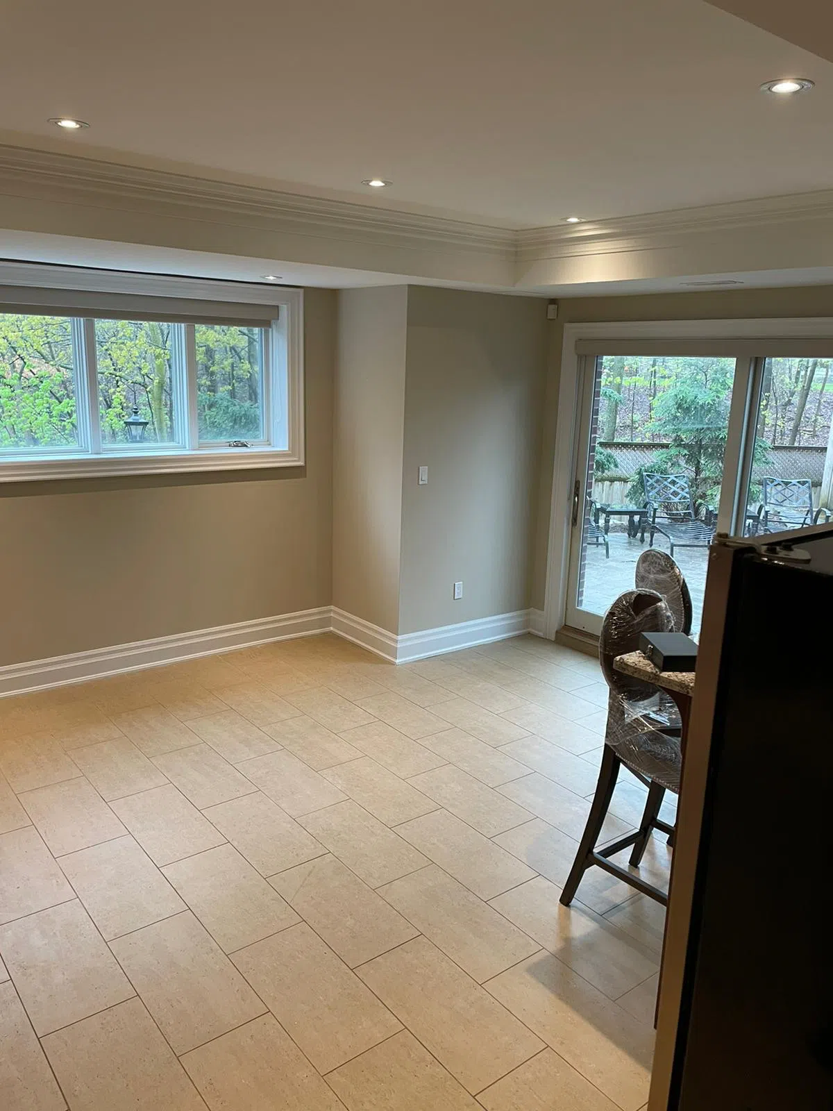
Light cabinet colours work best in small kitchens because they reflect light instead of absorbing it, which makes a compact, often windowless condo kitchen feel larger and brighter. Most Toronto condo kitchens are tight and open to the living area, so the cabinets set the tone for the whole space.
Heavy, dark cabinets on every surface do the opposite. They soak up light and visually shrink the room, which is why an all-dark kitchen rarely suits a small condo. That does not mean no colour, it means using colour deliberately, on a lower run or island, while keeping the light, open feel overall. The colours below all follow that principle.
Seven cabinet colours that work in condos
These are the colours we see succeed most often in small Toronto condo kitchens, from safest to boldest.
- Soft white. The brightest, most timeless, most resale-friendly choice. Pairs with anything.
- Warm off-white. White's cosier cousin, adds warmth without darkening the room. Great when pure white feels stark.
- Greige. A warm grey-beige that reads neutral and current, hides everyday marks a touch better than white.
- Soft warm grey. A light, warm-leaning grey for a clean modern look without going cold.
- Sage or muted green (light). A gentle colour that still keeps things light, popular in warmer palettes.
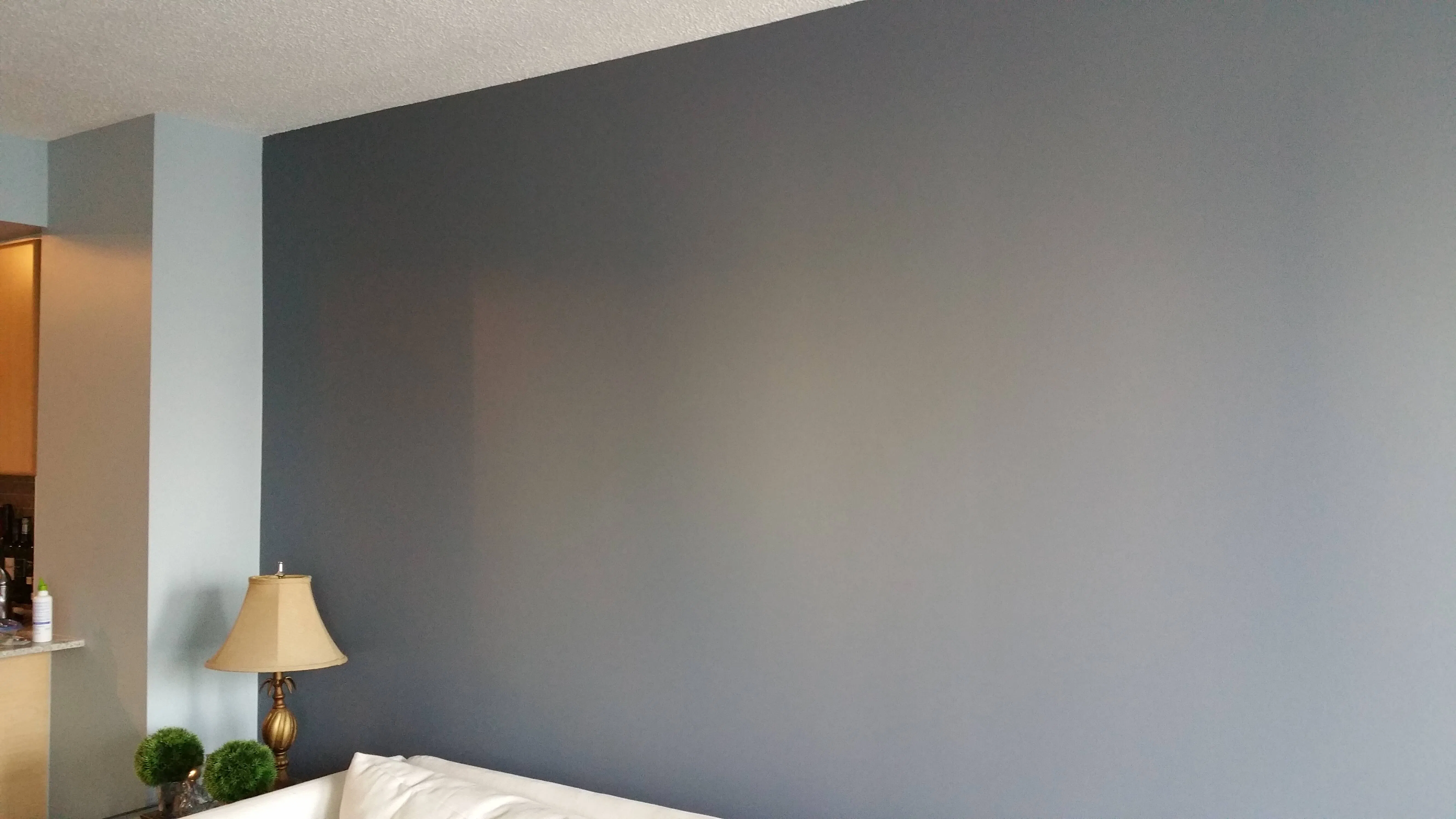
- Navy (two-tone). Deep and rich on a lower run or island, with light uppers keeping the room open.
- Charcoal (two-tone). A modern, grounding dark for an island, again paired with light upper cabinets.
The first five keep the whole kitchen light. The last two are accent colours best used in a two-tone scheme. For more colour direction across the unit, the best white paint colours for Toronto condos and the best paint colours for small Toronto condos both apply to cabinets.
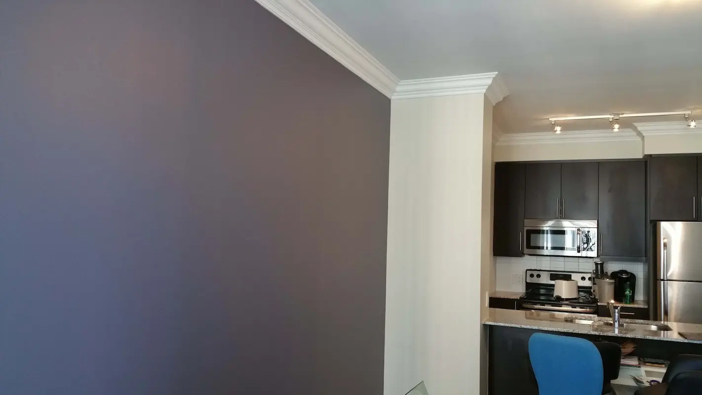
How does the two-tone approach work?
Two-tone means light upper cabinets with a deeper colour on the lower cabinets or the island. It is the way to get the richness of a dark colour without shrinking a small kitchen, and it is one of the strongest current trends in condo kitchens.
The logic is visual weight. Keeping the uppers light means the eye reads the room as open and airy, while the darker base grounds the kitchen and adds personality. Navy, charcoal, and deep green all work for the lower colour. The approach also suits condos practically, since the lower cabinets and island take more scuffs, and a deeper colour hides them better. Strong under-cabinet or natural lighting lets a small kitchen carry a bit more depth of colour, so factor your lighting into how dark you go.
What colour is best for resale?
For resale, soft white and warm off-white are the safest, highest-return cabinet colours in a Toronto condo. The kitchen is one of the rooms buyers judge hardest, and a fresh, light, neutral finish reads as updated and move-in ready, and photographs bright and clean for the listing.
Bold or unusual cabinet colours can date quickly or put off buyers who would have to repaint, which works against you on a sale. If you want a little character while staying safe, a restrained two-tone with a navy or charcoal island over white uppers is broadly popular. The selling goal is wide appeal and a bright, current look, which neutral cabinets deliver. For the bigger pre-sale picture, see why painting beats replacing before listing.
Specific Benjamin Moore colours we use most (with LRV)
We paint Benjamin Moore exclusively, so the colour discussions in our quote conversations always end on specific paint numbers, anchored to Light Reflectance Value (LRV), the 0-100 scale measuring how much light a colour reflects back into the room. For small condo kitchens, LRV is more useful than the colour name because it tells you objectively how bright the cabinets will read.
| Colour | BM code | LRV | Category | Best for |
|---|---|---|---|---|
| White Dove | OC-17 | 85.38 | Warm white (greige undertone) | Default all-rounder; works in any light |
| Simply White | OC-117 | 91.70 | Bright warm white | South-facing kitchens; photographs crisp |
| Chantilly Lace | OC-65 | 92.20 | True white, minimal undertone | Modern, high-contrast units |
| Swiss Coffee | OC-45 | 83.95 | Soft warm cream | North-facing kitchens needing warmth |
| Revere Pewter | HC-172 | 55.51 | Warm greige | Kitchens with warm wood floors or counters |
| Pale Oak | OC-20 | 69.79 | Soft greige | Cabinets when pure white feels too stark |
| Kingsport Gray | HC-86 | 50.30 | Cooler greige | Modern condos with cool stone counters |
| Hale Navy | HC-154 | 6.30 | Deep navy | Two-tone: lower cabinets or island |
| Wrought Iron | 2125-10 | 6.16 | Near-black with blue undertone | Two-tone: dramatic island or lower run |
| Amherst Gray | HC-167 | 16.20 | Medium-dark grey-blue | Two-tone when navy is too saturated |
Why LRV matters for cabinet colour selection
The LRV scale tells you objectively how a colour will perform in your specific kitchen light:
- LRV 80+ (whites): maximum light reflection; best for small kitchens with limited windows
- LRV 65-80 (light greiges): bright but with subtle warmth; modern but not stark
- LRV 50-65 (warm neutrals): starting to absorb meaningfully more light; works in well-lit kitchens
- LRV 30-50: feature colour territory only
- LRV under 30 (navies, charcoals, blacks): deep colour; two-tone use only in a small kitchen, never on all four walls of cabinets at once
The two-tone math works specifically because of LRV contrast: a Hale Navy (LRV 6.30) lower run paired with White Dove (LRV 85.38) uppers creates dramatic visual weight at the bottom and maximum light reflection at the top, exactly the "grounded but open" effect designers describe. Putting Hale Navy on both uppers and lowers in a small condo kitchen produces a beautiful but visually heavy room that reads smaller than it actually is, only do this with intentional design lighting and acceptance of the cocooning effect.
These are starting points. Every condo kitchen has its own light, its own counter and floor combination, and its own daily-use pattern, so the final colour pick comes after a large-swatch test on the actual cabinet doors during the quote. A two-foot painted board sitting in the kitchen for a day, viewed at 8 a.m., noon, and 7 p.m., tells you far more than a paint chip ever can.
How Toronto light affects cabinet colour
Cabinet colour does not exist in isolation; it is finished by the light hitting it, and Toronto light varies dramatically by orientation, season, and neighbourhood. The four common condo orientations and what they do to cabinet colour:
North-facing units. Cool, indirect light all day. Whites can read grey or even slightly blue. Warm whites (White Dove, Swiss Coffee) and warm greiges (Revere Pewter) usually outperform cooler whites in these units, because the warm undertone counteracts the cool light. Cooler whites (Simply White, Decorator's White) can look clinical and flat in a north-facing kitchen.
South-facing units. Bright, direct sun for hours during midday. Whites can read warm or even yellow under midday sun, then return to neutral by evening. Cleaner whites (Simply White, Decorator's White) usually outperform warmer whites here because the room is doing the warming already. Test colours in midday light, not morning light, in south-facing units.
East-facing units. Strong warm morning light that fades to neutral by afternoon. Cabinets that read soft and warm at 8 a.m. can look slightly cool by 4 p.m. Mid-warmth whites (White Dove, Coastal Path) handle this swing better than colours that lean strongly in one direction.
West-facing units. Cool morning light that turns golden in late afternoon. The opposite swing of east-facing units. Same recommendation: mid-warmth colours handle the swing more gracefully than colours that commit hard to one undertone.
Lakeside units (Humber Bay Shores, Harbourfront). Bright reflected light off the water adds an extra cool-bias layer to whatever orientation the unit has. Warm whites tend to read more neutral than they would in an inland unit. Greige can land closer to pure grey.
Hardware finishes that affect colour reading
Cabinet hardware is the second-largest visual factor on a cabinet job after the paint itself, and the finish choice changes how the cabinet colour reads. The four common hardware finishes and what they do:
- Brushed nickel. Cool, modern, neutral. Works with almost any cabinet colour. Pulls warm cabinets slightly cooler.
- Matte black. Strong contrast on light cabinets, grounds the kitchen, currently very popular. Can feel heavy against pure white if used on every door; we often use it as accents (handles only, not knobs) to balance.
- Brushed brass or champagne bronze. Warm, slightly traditional, photographs beautifully. Best on warm whites and greiges; can clash with cool whites.
- Polished chrome. Older finish, more traditional. Reflects strongly under pot lights.
We discuss hardware during the colour conversation because the two decisions interact. A small kitchen in cool light with warm-white cabinets and brushed nickel handles is a different room than the same kitchen with brushed brass handles, even though only the hardware changed.
Choosing your cabinet colour
Start with how much light your kitchen gets and whether you are staying or selling. Low light or a sale points to soft white or warm off-white. Good light and a desire for character open the door to a two-tone island in navy or charcoal. Either way, keep the overall feel light in a small condo.
Colour conversations happen in the kitchen itself, with a two-foot painted board sitting against the cabinets through a full day of light. We work in Benjamin Moore exclusively, so the swatch we hand you is the colour you get. 5-year warranty on the workmanship. If you want a colour that makes your kitchen feel bigger and brighter, send some photos. For the full process and pricing, our condo kitchen and cabinet painting guide covers the rest.
Chad Saygili is co-owner of Condo Painters Pro, a Toronto condo painting specialist. He has spent years painting condos across Toronto and the GTA, works exclusively with Benjamin Moore, and backs every job with a 5-year workmanship warranty.
MORE ABOUT OUR TEAM →